The final polish- color, typography, and animation in UX design
In our last articles on UX design, The Art and Science of User Experience Design and UX design: Exploring user behaviors for design success, we explored the planning and prototyping stages of building a user-centered product, and touched on the topic of UX laws that are deeply rooted in human behavior. Now it’s time to breathe life into our functional prototype using on-brand color and typography. We will also look at how animation can enhance the user’s experience to make it more delightful and fun to use.
Final polish and handoff
Now that you’ve stated exactly what the solution does and clearly defined flows of action users take to achieve their goal, it’s time to polish those wireframes with a clean user interface. Note that prototyping can happen even after the graphical elements like buttons, fonts, and colors are defined. This is because a lot of digital products are offered as a service and are constantly updated with new features, thus requiring iterations of different functions.
First, we’ll look at how color theory can aid us in crafting beautiful UIs and thus enhancing the user’s experience.
Impact of color
Color psychology in UX is important in convincing the user to make a purchase and also in establishing brand communication towards users. Since color is considered as the easiest element to remember, this element is applied in UX as well as marketing.
Color is a visual stimulus that immediately provokes emotions and reactions. Psychologists suggested that color impression accounts for 60% of the acceptance or rejection of a product. Thus, a bad color combination can greatly affect the whole user experience, with the same effect as a bad copy or a slow page loading time.
We all have color preferences, however, there are similarities of preferences among same age groups, between genders, and cultures. For example, research shows that bright colors like yellow and red are favored within a younger age group, while shorter wavelength colors like blue, violet, and green are preferred by adults and the elderly. Color meanings can also vary from cultures: in the West, white means innocence, aspiration, and hope. In Asia, however, white color is for death, mourning, and bad luck. As a UX designer, you need to be aware of these cultural connotations, especially if you are marketing for a specific location or culture group.
It is also important to factor in the number of colors used. We usually only stick to a few (one or two colors), and tend to use a lot of white space with accents of vibrant color to attract the eye to that particular element, usually in a way of a call to action (CTA). If you do use too many colors, especially if they’re all super bright, you’ll lose hierarchy with everything fighting for attention. 82% of all companies only use up to two colors incorporated in their logos.
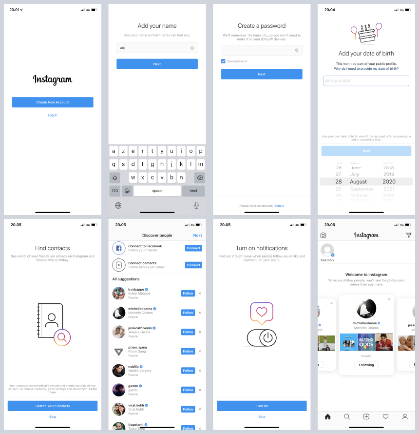
The ‘60/30/10’ rule is that you have a primary color, which takes up a 60% ratio, and then a secondary color which takes up 30% and lastly an accent or touch of color which takes up 10%. Note the colors used in Instagram’s onboarding flow:

Parts of Instagram’s onboarding flow
Type
Typography in UX/UI design should increase the legibility of the message, increase engagement rates, complement the copy, and bring the overall user experience to a higher level. Good typography will capture attention and encourage users to start reading. That’s why UX and UI designers, UX writers, copywriters, and other marketing specialists often work together – to deliver enticing and captivating content that will look as good as it sounds.
Good fonts, proper spacing, and intelligent choices of colors and contrasts will make users engage more with the text of your digital product. Additionally, focusing on typography in UX/UI design also builds the image of your business. When the overall typography matches the brand identity, it leaves the impression that a company has its affairs in order. Such an impression immediately elevates users’ trust levels and builds recognition.
- You should use a maximum of two typefaces in your digital product. More than that will cause noise and disruption the readability.
- In case you don’t have a copywriter or UX writer in your team, always choose to make your text simple and sweet.
- Test the scales, animations if you have them, colors, and whitespaces; see what works best within your preferred users.
Animation
UX and UI designers use animation to guide them around the interface, alert users of a change, influence users’ decisions, and indicate a relationship between elements—among other uses. UI animation also reduces the mechanical feel of a website or app, creating a much more natural and intuitive experience.
In UI design, animation can be functional or decorative. Functional animation guides and informs the user in real-time, whereas decorative animation is an essential storytelling and branding tool. The most common UI animation types tend to fall into these four groups:
- Micro-interactions
- Loading and progress
- Navigation
- Storytelling and branding

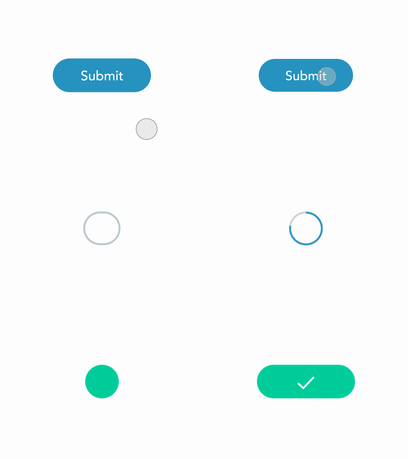
Example of micro-interaction animation that informs and delights the user in real-time
Final thoughts
We learned that while some people prefer certain colors to others, color plays an important role in perceiving and experiencing the product, and we should use it sparingly and in a way that guides the user to a specific action. Typography is also an important factor when perceiving the brand and tone at which something is presented – above all, make it legible and easy to read! Lastly, we learned that animation can aid in experiencing our interface in a more fluid and dynamic way as opposed to a static transition. All these should be taken into consideration if we want to create unique and delightful user experiences.

We do it with passion and dedication.
CONSENT TO PERSONAL DATA PROCESSING
I hereby acknowledge and agree with the processing of personal data, which I submit to owner and controller Solviks, programske rešitve in poslovno svetovanje, d.o.o. ((ang. Solviks, software solutions and business consulting, d.o.o) Počehova 59i, 2000 Maribor, Slovenia, e-mail: info@solve-x.net) on the Website.
I hereby acknowledge and agree that the personal data provided is processed for the following purposes:
- marketing purposes relating to offers of products and services;
- sending information about products, services and other activities.
Solviks, d.o.o. is processing name, surname, e-mail.
The legal basis for the processing of personal data is the consent of individual under Article 6(1) of General Data Protection Regulation – GDPR.
I hereby acknowledge that the personal data which I submit will be processed to the extent necessary to achieve the above-mentioned purposes.
I hereby represent that I have been informed about my right to:
- withdraw my consent to personal data processing at any time- GDPR, Article 7;
- right to be informed- GDPR; Article 13;
- obtain access to the personal data held – GDPR, Article 15;
- incorrect, inaccurate or incomplete personal data to be corrected – GDPR, Article 16;
- request that personal data be erased when it is no longer needed or if processing is unlawful – GDPR, Article 17;
- request the restriction or suppression of personal data – GDPR, Article 18;
- receive personal data in a machine-readable format (data in a data format that can be automatically read and processed by a computer) and sent it to another controller – GDPR, Article 20);
- object to the processing of personal data in specific cases – GDPR, Article 21;
- request that decisions based on automated processing concerning or significantly affecting a person and it is based on personal data are made by natural persons, not only by completers – GDPR, Article 22 (automated is only a process of inviting members to participate in surveys);
- object to the transfer of my personal data.
I hereby acknowledge that I can submit a complaint to the Information Commissioner in Slovenia (Dunajska cesta 22, 1000 Ljubljana, e-mail: gp.ip@ip-rs.si, phone: 012309730, Website: www.ip-rs.si).
I hereby acknowledge that personal data requests and any other questions about personal data can be sent to an e-mail: vesna.brlic@solve-x.net or info@solve-x.net.
I hereby represent that I have carefully read all the above provisions and do voluntarily and unequivocally agree with them.
